Deeper Insights Into Our Work —
5 STUNNING BEFORE & AFTERS
Who can resist a good before and after view of a space?! Well, we can’t either since it always blows our minds how much a space can change! We’ve been at this for 15 years, so here are a few of our favorites to share with you. Notice how these spaces start out so much the same.
Boring, bland, dated and certainly underutilized. I think it’s important to realize that most of us purchase a home and find similar challenges. It’s the attention to detail and thoughtful design that makes these changes so significant. It’s the artistic interpretation and refined pattern and color play that makes each of these spaces unique to the personalities of their owners.
Enjoy the view and let us know which is your favorite below.
xLS
1. Rathervue Place Master Bedroom
Located on the second floor of a 1941 house, this bedroom was truly aching for attention. With many features original to the house, the space was in need of a big update and a much clearer sense of functionality. Turnstyle’s design for this room centered on creating thoughtful, functional, and clearly defined areas with a colorful vibrancy throughout.
Typical of Turnstyle Design’s irreverent love of hues, pattern and color, these were mixed and mingled for a playful, rich aesthetic. Interwoven with both modern and traditional accessories, our carefully chosen décor helps to update the home, add personality, and keep it true to its era’s roots. The result is a space that manages to be both relaxing and invigorating – the perfect place to start each day anew.
2. Rising Hills Fireplace
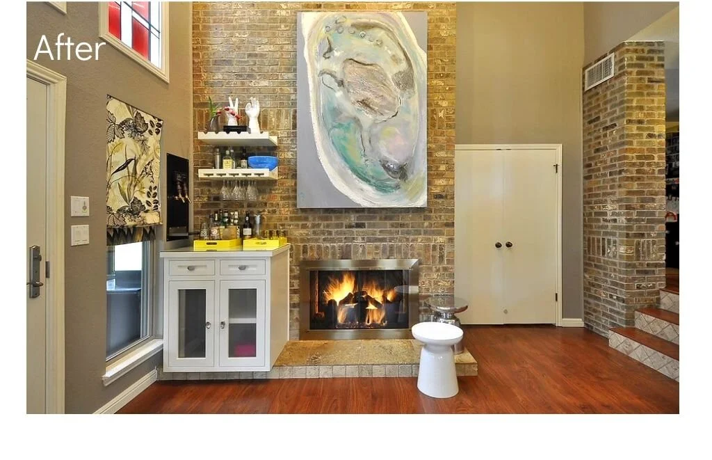
Never used and always admired, this fireplace was simply sort-of “stuck there” as the homeowner would mention. We decided to dedicate true functionality to this space, refitting it with a custom frame and remote-controlled start button to provide immediate ease of use. We also added a bar with a custom built-in wall tap to give both him and her a place to play and entertain guests. This large-scale artwork beautifully highlights the brick, making this space the best place to be at a party.
3. FLAT TOP LIVING ROOM
A large family home, we dug into very specific details by designing everything from stair railings and flooring inlays to light fixtures and cabinetry. With gorgeous finishes, this home is now ready for day-to-day living intersecting luxury with approachability. This home nods at its intended architectural style while maintaining its individuality. We created various fluid seating areas to influence total use of the house. Incorporating our signature play of strong pattern and color, each room is carefully concepted to bring softness and intimacy to an expansive floor plan. Our design resulted in an amiable high-end home, free of any aloofness easily expected in a home of this caliber.
4. MEADOWVIEW KITCHEN
A young couple in need of a larger kitchen, we were asked to remodel this kitchen and turn up the volume on color and playfulness. While every project I design is tailored specifically to the inhabitants of the home, each concept is also designed through my creative lens. This couple sought out my bold use of color and pattern, which we youthified and personalized directly to them.
We doubled this kitchen in size; yep…doubled it!
Tongue in cheek references like the bright orange range, alongside terrazzo inspired accents, align not only with the mid-century architecture but also with their sense of humor. Black and white graphic countertops, play with green and gray cabinets. A custom island makes space for lingering, while an eat-in kitchen helps start the day on the pink side with custom upholstered booths. Open shelving, and plenty of European style cabinetry storage, solves everyday space needs.
5. MANANA MASTER BEDROOM
With a focus on public spaces, we nearly all forget to prioritize our own personal space, which ends up being our bedrooms. For this project – a master bedroom, our client lovingly made it a priority, requesting that we help them feel great there. That should always be the goal of any space – period.
But for a master bed, good design adds tenderness to that feeling. By opening up the space and brightening it with a beautiful color palette of grays, linens, whites and blues, this room now feels calm and well-tended to.
So you see, we can all find ourselves in each of these. Take the time to consider what impact – what personally fulfilling impact real change in a space can make.
We hope you’ve enjoyed this glimpse, and give us a shout if we can help you get started on reimagining your own space. It needn’t be overwhelming – it’s meant to be fun!


