Tiling From Head To Toe —
FLOOR TO CEILING TILE STEALS THE SHOW IN THESE TURNSTYLE DESIGNS
You may have noticed that almost every time I to tackle a kitchen remodel, there’s nothing I love more than tiling it floor to ceiling. Yep, give me the chance to get into tile, and more is always better! I have definitely mastered what to do and how to do it when it comes to tiling and I never get bored! Space, as you may know, must be considered as something that’s been layered in several steps. It has to grow into itself and satisfy many variables to keep any person in it interested.
A room should be approached in such a way that the end user is immediately comfortable, whether they realize why that is or not. On the flip side, enough must be noticeable to keep the person interested and the engagement constant – those are the types of spaces that speak to the best part of our human-nature; the dimensional part.
Because so many factors go into creating beauty and comfort, I like to expose that beauty fully and in-depth. Imagine the weight of a material. Imagine the feel – the shift in its color as the light changes during the day. Tiles should be incredibly beautiful things. They are often hand-made and certainly more often than not layered in either a texture or color or both. The intricate way they each puzzle together, nestling alongside each other to form a large mural. These components are part of why so much emphasis must be placed on stretching this material as far as it can go.
Take a look at this example. A modern Art Deco marble-mix tile. This is fresh. It is bold. It is modern and classic all at the same time.
I could wax lyrical about my love for Deco. It has an industriousness to it that holds up the richness of well-made materials such as brass, terrazzo, marble, gilt – the list goes on – alongside a reverence for making things well. The Deco period was sumptuous. It was brazen and heady and refined.
I use a classic like this marble hexagon Deco tile, because it tempers anything modern day and keeps it timeless. You can walk into this kitchen in 30 years and it will still have appeal, precisely because of its overall shell. And tiles set up that shell – the basis upon which we trim out a kitchen and fully form it. Used floor to ceiling in this space, this tile wall acts as a backdrop from which to play in the space – something we all do (or would certainly like to imagine ourselves doing) in our kitchen.
For another kitchen project, I again used marble, but in a herringbone pattern. I wanted the flow of this kitchen to be airy and soft. My choice here is quietly luxurious. It doesn’t need to scream out. It draws you in to want to touch it. The color palette and softness of this material are instantly inviting.
Light changes this one pretty distinctly, so it’s one of my favorite spaces to see at different times of the day. The matte surface on the tiles, known as a “honed” finish, keeps it from detracting from anything around it. It’s one of those tiles that makes you want to linger with it.
In my kitchens, as in all my spaces, my aim is to encourage a person’s participation and enticement to stay. We must always feel like our best selves in a space – that’s how you know it’s great. With floor to ceiling wall tiles, one feels like all attention was paid to detail and the whole space was cared for. Aesthetic value, texture and tone are all support systems for gloriously setting that up and making a space unique and entirely personal.
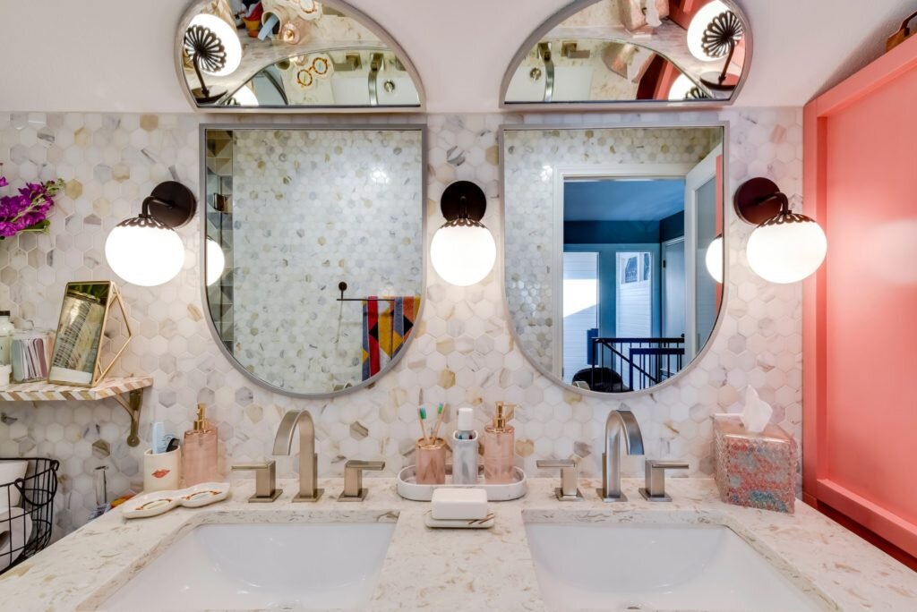
Bathrooms are another space in which I love to utilize tile to the fullest. In this example, I chose a specific combination of tiles to give the space a personal feel for three growing girls.
Playfulness and openness go hand in hand with this palette, and materials stay fresh and young, but with a sophistication that leaves room to grow and mature. Marble tile from floor to ceiling helps ensure the spaces luxe quotient goes way up, and gives the space long-term appeal.


