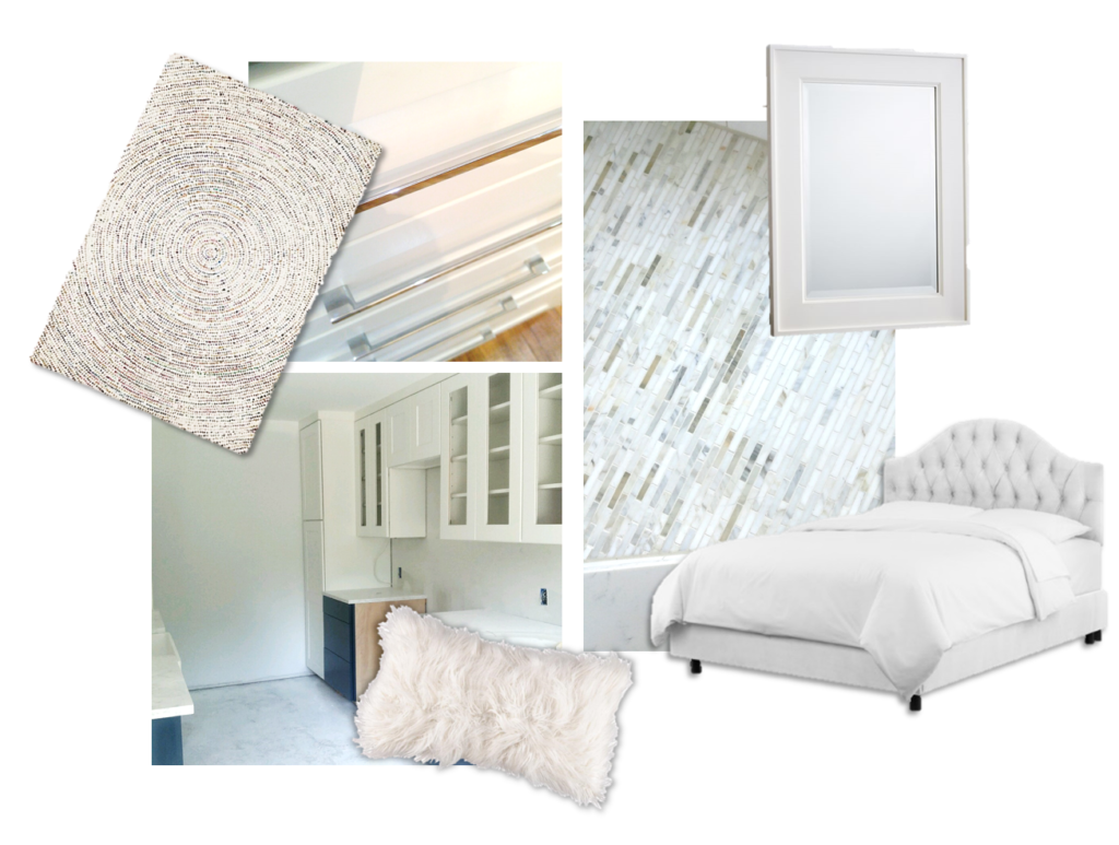
Using White In Design —
WHITE IS INTEGRAL TO ALMOST ANY SPACE… BUT WHY?
Firstly, white serves as a great palate cleanser for the eye. Allowing us a moment to pause, it prevents areas from becoming too overloaded with color and activity. Secondly, it keeps things fresh. Take any room, even after it has aged, and you’ll immediately see that white accents keep their brightness better than anything else – even after wear and tear. The clarity that comes from this color makes it easy to keep its luster at the top.
Thirdly, white is a FANTASTIC vehicle to highlight architecture. Because it strikes a clear mark, it defines a place like no other. It lifts ceilings, widens the walls of even the tiniest of rooms, and gives you mental and visual breathing room. White is the true transformer of spaces.
But how to approach it? There are so many different whites in the world! Well, start with thinking about what you wish to accomplish in your space. Are you seeking warmth or brightness? Are you in need of purity or accents? A warmer white helps address approachability and warmth, while crisper whites exact things up. Untainted whites are perfect for definition, while whites with pink or blue undertones will help you tie into something else.
When choosing white decor, fixtures, and appliances, you’ll find that your choices are endless. By removing color from the equation, your options become much more open, as texture, temperature, patterns, etc. become the focus. White is the great balancing value: suddenly, pairing many different qualities in texture and pattern and accent colors like gold, become effortless.
At Turnstyle, we use white a lot, and in all sorts of ways. We love it as a palate cleanser and frequently add it to custom pieces like built-ins for helping ground a room’s architecture. We love it on walls in its warmer version to make a space feel like it might just wrap itself around you. And with décor, you’ll find white all over our projects, simply because when used in variation, wonderful textures and patterns arise.
So think of white and gather options. It’s a true multi-purpose use color that can take on many pleasant forms.
Check out our tips and picks below on using white at its best.
What to Keep in Mind When Picking Your White
Paint Your Swatches LARGE – White takes a minute to be seen. Make sure you have an entire view.
Check Your Lighting – Take a swatch both outside and into the room you plan to use it in, so you can see your option in true light.
Go for Coats – Contrary to popular belief, white looks much better in multiple coats. You’ll end up with a richer, higher end finished product.
Be Careful When Choosing – a grey-white can quickly make a room look dingy. This grey-ified effect has its place, but beware.
If you enjoyed this helpful hints blog, make sure to visit our Instagram, Facebook, Houzz and Pinterest, to keep up with our latest projects and receive your daily dose of our unique design content!


