CALLANISH PARK
KITCHEN
Imagine you are a family of five, most of you have now grown up and all of you love cooking in the kitchen. But, the kitchen is old, filled with things that are hard to find and in need of serious help!
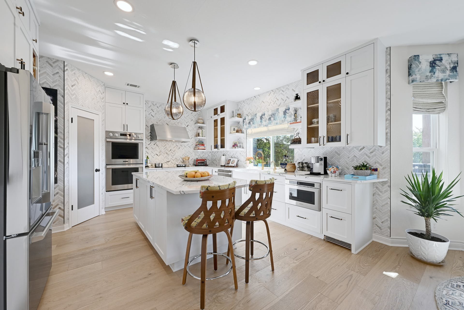
For this client project our remit was simple - take a very dated non-functioning kitchen, and make it sleek, light, bright, airy - and a place you'll always want to spend time in. Whenever I walk into a room, I immediately know what it needs. When I walked into this kitchen, it was clear that we needed zones. We needed moments where everyone could work independently or together, as they wished. And we need something that felt refreshing.

FORM IS FUNCTION
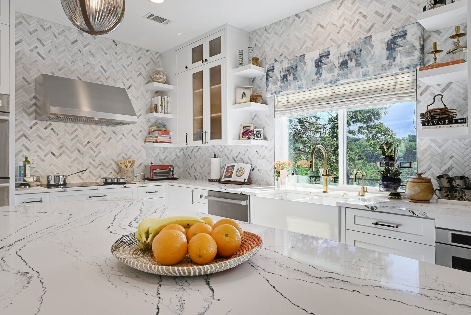
Floor to ceiling marble tile, sets the space up for beautiful, yet utilitarian function. Classic, and always easily wipes down, this herringbone pattern really plays up the proportions and architecture of the space.
OUT WITH THE OLD, IN WITH THE NEW
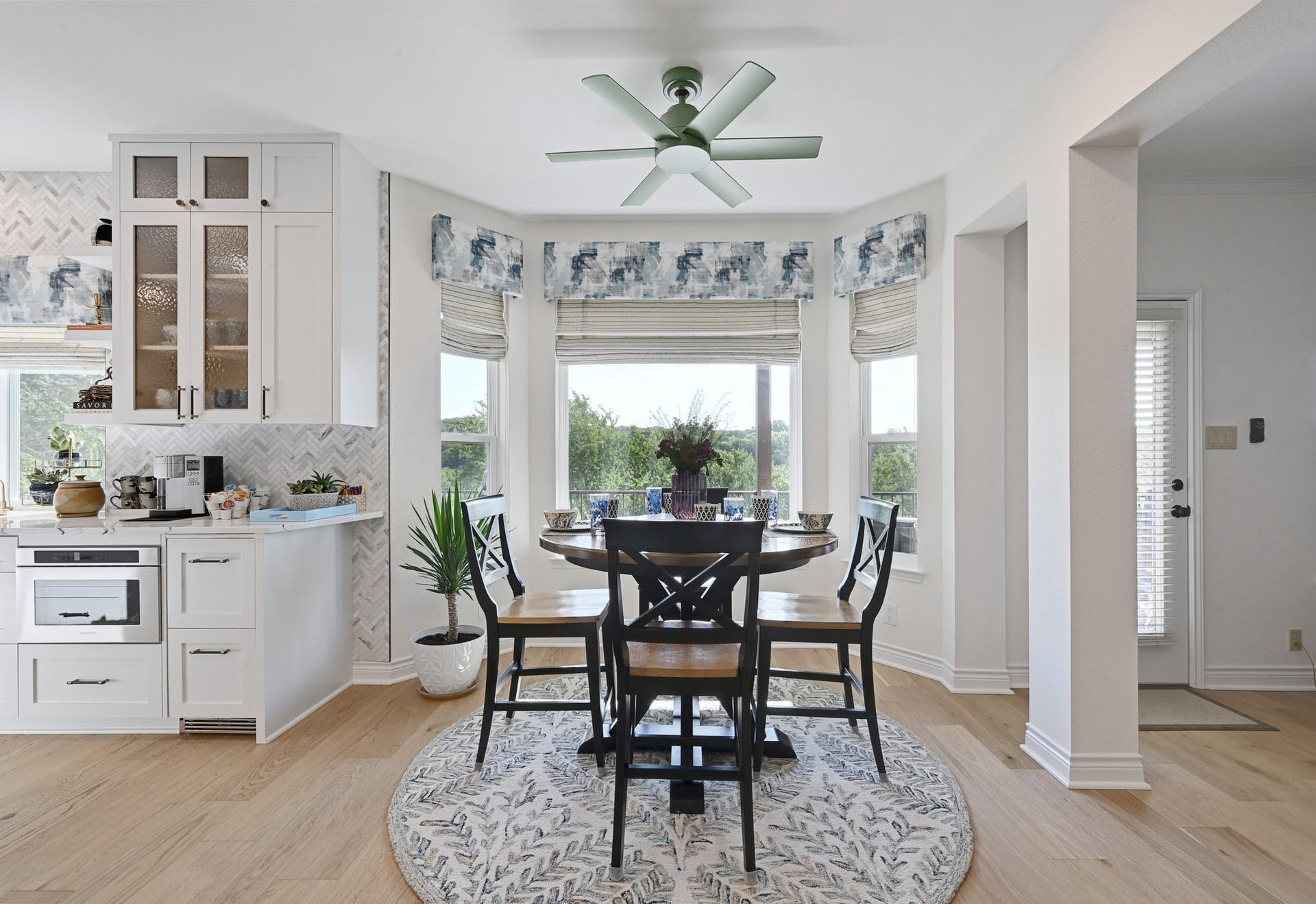
New floors, new doors, new custom cabinets all lay the ground work for better space use, lighter color palette and a dreamy place to find inspiration. Gorgeous, painterly quartz countertops, are ready to receive rolling pin and dough layouts, while each window is perfectly framed with another of Turnstyle's signature custom window treatments.

With the help of Lieve Saether’s crew at Turnstyle, the design tapped into functions, colors, textures, and flow that at first glance seemed a bit foreign but proved to be beautiful, practical and an absolute delight to work in. Every detail was thought out to the point that we now wonder how we did without those innovations for all these years. The results are fabulous!
- MS, Turnstyle client
Great space organization, and clever drawer pull-outs allow for everything to have its place and light fixtures with unique sculptural shapes keep the space well lit, and the eye looking up.
As always at Turnstyle, it's personal to the family we create for, and it's a pleasure to have found this family so excited and at ease, eager to cook for days.


